01

Expanion

Building user trust in AI-assisted expense management.
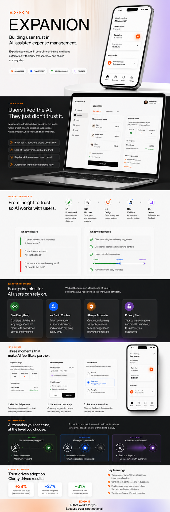
Meals & Ent. ×
Software ×
Travel ×
Office ×
Self-care ×
9:41
Hello, Celso!
What expense
do you want to
submit today?
Submit expense
View history
Describe your expense…
🎤
Recent Expenses
C
Client dinner — Q4
Meals
$87.50
U
Uber to office
Travel
$23.00
F
Figma annual plan
Software
$144.00
Home
Inbox
Submit
History
Where expense management finally makes sense.
An AI companion that watches you fill out a form and quietly makes sure every entry is right — before you hit submit.
Role
UX Designer · Product Design · Interaction Design
Context
UX Capstone Project — Part 3 of 3
Deliverables
Prototype · Trust mechanisms · 3 design variants
02
The Problem

Users liked the AI.
They just didn't trust it.

Two rounds of user testing proved the supportive tone was right. What they didn't prove was durability. Users liked the first interaction — but trust over time requires something more structural than good intentions.

Expanion is an AI assistant embedded in the expense submission form. It watches the user type, analyzes the entry in near real time, and responds with suggestions — categories, mismatches, evidence from past expenses.

Two test sessions surfaced a consistent gap: users wanted to see the reasoning, not just the outcome. And a confidence indicator labelled "high / medium / low" raised more questions than it answered.

"Confidence in what, exactly?"

Test user — Part 2 session. The observation that drove every change in Part 3.
Users asked "why?" before acting on any AI suggestion
"High / medium / low" label was ambiguous — confidence in what?
Real-time updates on every keystroke felt jumpy, distracting
Supportive tone landed well — emotional direction confirmed
Side-panel layout worked: users found the split intuitive
03
Design Process

From testing gaps
to a trust framework.

The revision mapped every user observation to a design principle, and every principle to a concrete UI element. Nothing changed unless it solved something.

🧪

Usability Testing

Wizard of Oz + hi-fi prototype, 2 sessions

🔍

Synthesis

Mapped failures to trust dimensions

✏️

Wireframing

Card template, modal, and variant flows

🎨

High Fidelity

Full interface, 3 variants, dark + light

🔁

Design Review

Each change traced to course principles

TITLE — conclusion in one line Short body: reasoning behind the call → Primary action TITLE — next state Always same structure regardless of severity → Secondary action Each card: stripe / title / body / action Shape never changes between states → predictable User learns the grammar once

Card template — consistent across all severity levels

Why this suggestion? × WHAT EXPANION READ "Dinner with client — Q4 strategy" · $87.50 HOW IT CHECKED 1. Parsed "dinner" + "client" → meal intent 2. Compared against 14 approved meal expenses 3. 100% filed under Meals & Entertainment CONFIDENCE BY FACTOR Description clarity Historical match Completeness of notes

Transparency modal — every suggestion can be fully inspected

EXPENSE FORM Description Category ▾ ⚠ may not match Submit expense ← 600 ms after typing stops one check, result stays steady EXPANION ⚑ Category mismatch Apply fix / Keep mine One small thing to add → Append to notes Similar expense — Feb 14 → View for reference

Two-panel layout — form left, AI right, 600 ms debounce

User ctrl Auto mation A Guided AI hints only ~55 s avg B Expanion ★ Shared ctrl ~28 s · default C Autopilot Receipt → tap ~8 s avg User selects preferred variant in settings

Control / automation dial — three distinct variants

04
Trust Mechanisms

Four principles,
four concrete UI elements.

Trust over time requires that a system's reasoning be inspectable, its behaviour consistent, its deference calibrated, and its learning visible. Each mechanism below maps to a principle and to a specific part of the interface.

01
Transparency

Every suggestion is openable

The "Why this suggestion?" link on each card launches a modal showing exactly what Expanion read, how it ran the check step by step, and a confidence breakdown per factor — replacing the single opaque "high/medium/low" label from Part 2.

02
Predictability

The shape never changes

Every card uses the same template: status stripe, title, body, action. The AI check fires 600 ms after the last keystroke — not on every character. Green always means confirm, yellow always means nudge. The user learns the grammar once and reads faster from then on.

03
Appropriate Reliance

The AI never submits for you

Expanion can prefill fields, but only the user can press Submit. When confidence on a specific factor is low, Expanion says so in the form of a question, not a statement. The system earns its keep by knowing when to step back.

04
Feedback Loops

Corrections become visible

When a user disagrees with a flag and taps "Not a mistake?", that correction is stored and shown back the next time a similar entry would have been flagged — "last week you told me to stop flagging this." Trust builds when users see the system learning from them.

05
The Revised Interface

Three moments
that show the system working.

Each screen translates one of the four trust principles into a specific interaction. The design uses the same visual grammar throughout so users learn to read it once.

Screen 01 — Transparency modal

The modal replaces the single "high / medium / low" label from Part 2 with a factored breakdown. Users now see exactly what Expanion is confident about — and where it's asking them to contribute.

The step-by-step section shows the literal evidence: the keywords parsed, the past expenses consulted, the approval rates. Users don't have to trust the system blindly — they can inspect its reasoning on any individual call.

"Confidence in what, exactly?"

This question, from a test user in Part 2, drove the entire modal design.
Screen 02 — The catch interaction
expanion.app/submit
Filter: Meals & Ent. × Travel × Software ×
New Expense
Description
Dinner with client — Q4 strategy
Category
Software & Subscriptions ▾
⚠ Category may not match your description
Amount
$ 87.50
Date
Apr 28, 2026
Notes
Add client name and business purpose…
Submit expense
Resolve the mismatch to continue
Expanion · catch flagged
⚑ Category mismatch — review before submitting
Expanion checked your 14 past "dinner with client" expenses. Every one filed under Meals & Entertainment — 13 of 14 approved within 2 days.
What you wrote
Dinner with client
→ Meals & Entertainment
What you selected
Software & Subs.
↑ Inconsistent
Apply fix
Keep what I chose
Not a mistake?
One small thing to add
Notes with client name + business purpose approve 40% faster. Want me to append this?
Append to notes →
Similar expense you submitted
Feb 14 · Meals & Entertainment · $92.00 · "Client dinner — Cirque pitch" · Approved in 1 day.
View Feb 14 entry →

Three changes from Part 2: Submit is disabled (not just warned), the mismatch comparison is side-by-side instead of buried in prose, and the fix is a separate action card so the user can accept without re-reading the evidence.

Screen 03 — Happy path on mobile
9:41
Expanion · Submit
✓ Looks good to submit
Category, amount, and notes match your approved pattern. 13 similar approved in under 2 days.
Why this suggestion →
One small thing to add
Client name speeds approval ~40%.
Client name added
Append remaining →
Similar — Feb 14
$92.00 · Meals & Ent. · Approved in 1 day.
Open for reference →
Submit expense →
Home
Inbox
Submit
History

The happy path is intentionally quiet. When everything checks out, Expanion confirms briefly and gets out of the way. The green card appears, the Submit button is active, and the user continues in one tap.

The nudge and evidence cards are present but subordinate — not alarms, just context. The warm gradient submit button signals readiness without demanding attention.

The visual grammar the user learned from the catch state now pays off: green stripe = safe, yellow = nudge, blue = evidence. No re-learning needed.

06
Three Variants

The automation dial
belongs to the user.

There is no single right point on the control / automation dial. Making it adjustable is itself a trust mechanism — it says the system knows you're more comfortable in some places than others.

Variant A

Guided

The user fills every field. Expanion watches but never touches the form — it shows small hints indicating what category teammates typically pick for similar descriptions. Every decision is explicitly human.

Best for: new hires learning policy, audit-sensitive categories.

~55 seconds per typical expense
Variant C

Autopilot

Drop a receipt. Expanion reads the merchant, amount, and category from the image and offers a one-click submit. Only runs when there is photographic evidence to reason from. Every output is undoable.

Best for: receipt-based expenses on the go. Risk: ambiguous receipts may go unreviewed.

~8 seconds per expense
07
Results & Learnings

Trust isn't earned
through accuracy alone.

The revision proved that inspectability, consistency, and visible learning are not optional features. They are what separates a tool users adopt from one they tolerate.

600ms
Debounce delay that eliminated the "jumpy" feeling reported by both test users
4
Trust mechanisms — each mapped to a course principle and a concrete UI element
Design variants giving users control over their own level of automation

The most important lesson was about the relationship between emotional direction and functional trust. Part 2 proved users liked the supportive tone — they responded positively to an AI that sounded like a helpful colleague. What it didn't prove was durability.

Trust over time requires something more structural than good intentions. The four mechanisms — transparency, predictability, appropriate reliance, and feedback loops — give the supportive tone something to stand on.

The three-variant design acknowledges a second truth: there is no single right point on the control/automation dial. Some users, some categories, and some moments call for more human control — not less.

Making the dial adjustable is itself a trust mechanism. It tells the user: we know where you are more comfortable than we do. That's the real answer to the instructor's note about strengthening user confidence — in both how the system communicates, and the reliability of its outputs.

Back to work